
The recruitment platform website redesign
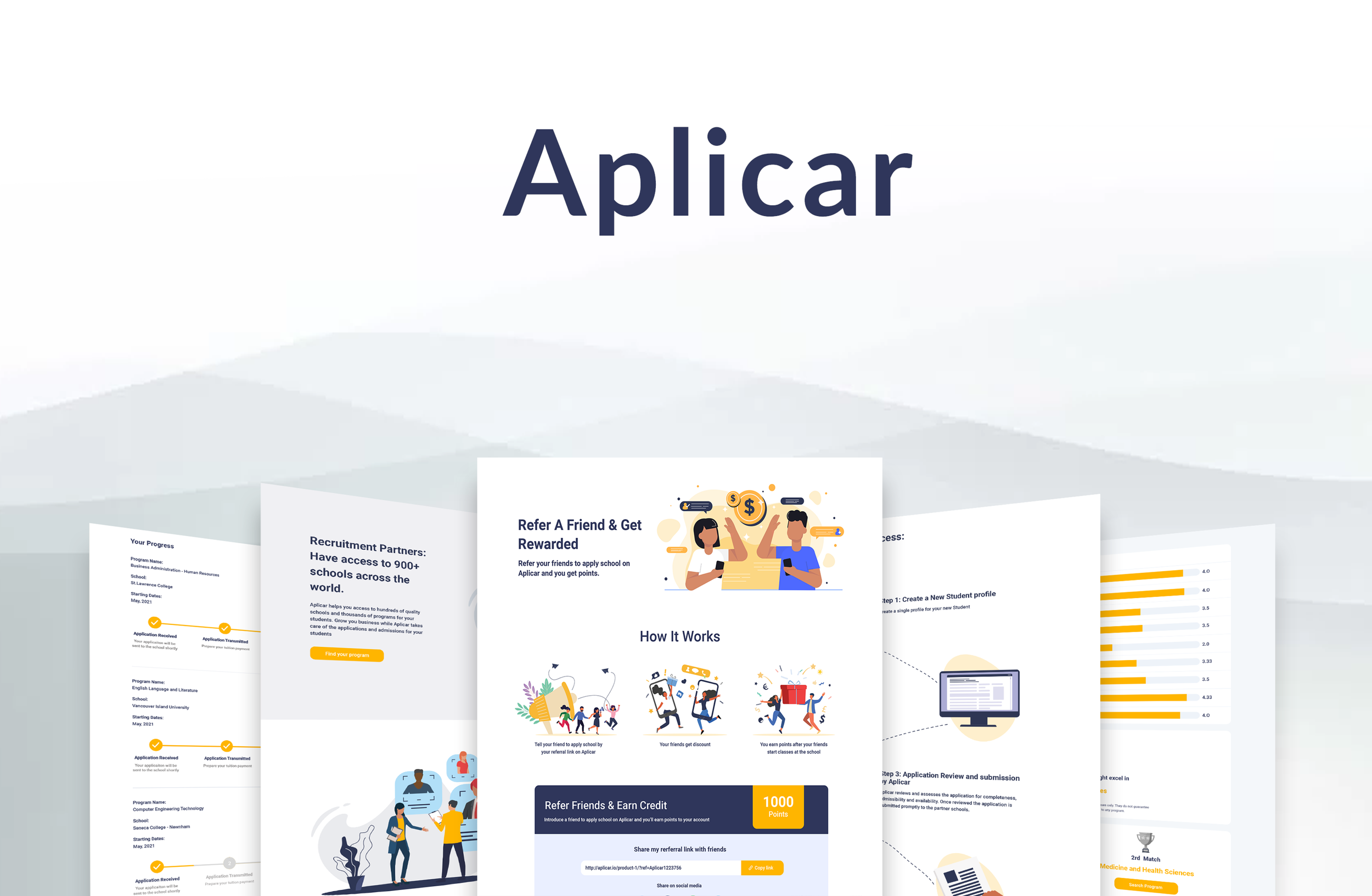
A application designed to
help you easily apply
your dream school
Aplicar is a comprehensive recruitment management platform designed to streamline the application process and enhance communication between recruiters, students, and educational institutions. Their platform simplifies application management, process tracking, and seamless communication. That helps international students apply for post-secondary studies abroad.
Problem
Redesign Website to leverage customer retention rates and minimize dropoff rates. making sure the interactions and flows are seamless, intuitive, and visually pleasing.
Solution
Aplicar provides simple and efficient for students and recruiters to archive their goals. Information is easily accessible and the knowledge of what to expect out of the process is laid out with ease.
My Role
Lead UI/UX Designer
Timeline
Overall: 5 weeks
Discovery & Research: 1 week
Design& Iteration: 4 weeks
Tools
Figma
FigJam
Adobe Illustrator
Slack
Zoom
Process
User Stories
User Flows
Wireframes
HiFis
Syle Guide
Dev Handover
MY PROCESS
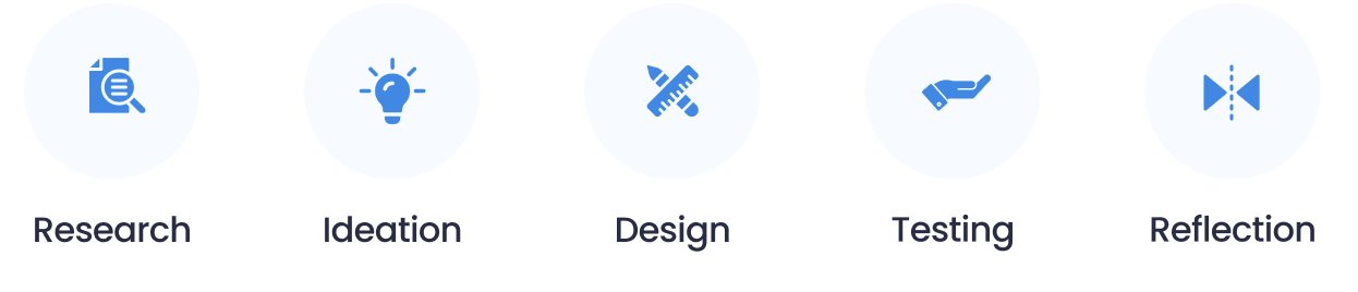
RESEARCH
Primary Research
To gain insights into how users handle study aboard search, I employed screener surveys to identify and select suitable participants. I then synthesized the findings from the screener surveys and subsequent interviews to create affinity maps, empathy maps, and personas. These tools helped me gain a deeper understanding of user behavior and design an app that caters to their needs effectively.
Surveys
When creating the screener survey, the main objective was to find participants who looking for study aboard. I built an online survey using Google Forms and shared it to various potential candidates. I received 15 submissions and based on these, selected 6 candidates to conduct interviews.


Interviews
I interviewed six participants who matched the target demographics, with a focus on looking for international student, I explored how they approached problem-solving, whether by hiring professionals. Through these interviews, I gained valuable insights into common habits, frustrations, and resources utilized or required by students.
Questions that elicited the most useful responses:
What is your general feeling about looking to apply school?
Can you tell me about the time you are apply school? How did that make you feel?
Did you run into any struggles/frustrations? If YES: can you tell me about this experience
Akash
“I want them to show me the whole application process before I apply”
Sajan
“I want to make the application process as simple as possible”
Kamal
“I go to many different study abroad office to ask for help”
Research Synthesis
With valuable insights gathered from my secondary research, surveys, and user interviews, I organized the findings into affinity and empathy maps. These tools aided me in creating design deliverables that effectively addressed the identified user needs and pain points.
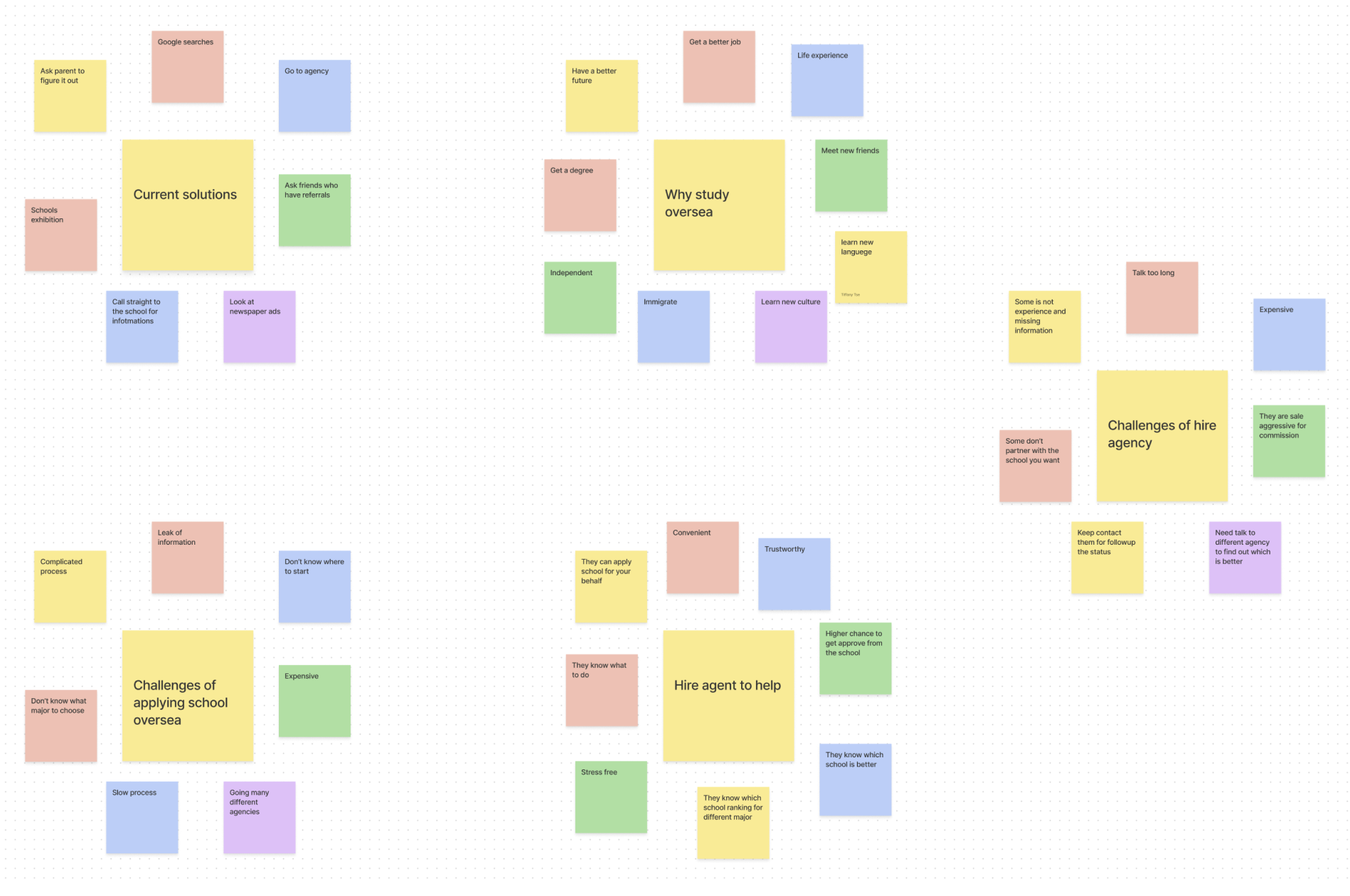
Affinity Mapping
With the information I abstracted from the interviews, I created an affinity map with the following 5 themes:
Current solutions being used
Why study oversea
Challenges of hire agency
Challenges of applying school oversea
Why hire agents to help
Empathy Map
By conducting empathy mapping, I successfully distinguished user personas:

Personas
After a deeper look into both empathy maps, I created a persona based on a student seeking to apply oversea university.
Micheal is a student that has just graduated high school and is looking to apply to university overseas to learn a new culture and find a job after graduation, but he is overwhelmed with the qualification checks and application process.

How Might We Statements (HMW)
Leveraging the insights gained from my research, I formulated "How Might We" statements to convey the most significant issues and prioritize them effectively to have the most significant impact.
How might we improve the chances each students results in the expected outcome
How might we create an easy way for users to apply university
How might we display all the important information that users want
How might we create an easy way for users to track their application progress
IDEATION
Brainstorming
With the "How Might We" statements as a foundation, I proceeded to brainstorm potential solutions to address the identified issues. Drawing from the research synthesis, I began sketching ideas and conceptualizing approaches to tackle users' problems.
User Stories
By utilizing user stories, I constructed a conceptual framework for the project and defined its value proposition for users. Based on these user stories, I sorted them into priority levels to establish a Minimum Viable Product (MVP).
As a user, I want to:
Be able to enter IELTS score to filter university .
Be able help users find out their interest
Manage all my applications in one place to better track what the status are.
Be able to communicate with agent

Site Map
After gaining a better understanding of my users' needs, I developed a sitemap with the goal of aligning simple application process and filter system. Although the sitemap has undergone changes from its initial architecture, it now incorporates insights from my initial sketches.
User Flows
Starting with the sitemap as a foundation, I created user flows to gain insight into how users would accomplish their intended task with minimal friction.
1. Do a user survey to find out potential interests
2.Select program and start time
3.Apply the program

DESIGN
Wireframes
In the initial round of medium-fidelity wireframes, I iterated multiple designs for each user flow. I evaluated whether I was effectively addressing the red routes by cross-referencing them with the HMW statements and sketches. These iterations helped me refine how I presented information and essential features.

Moodboard
Following some preliminary research and careful consideration of how to bring this brand to life, I honed in on the essential qualities to attain desired outcomes: reliability, the capacity to interact with fellow users, and the capability to share information.
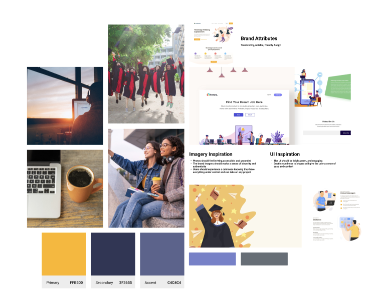
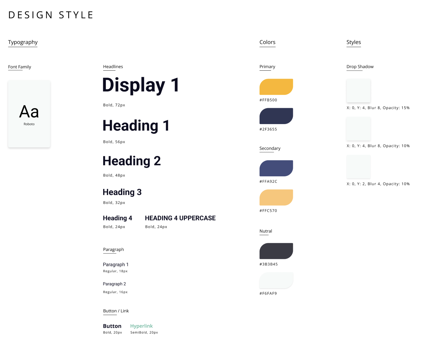
Style Guide
To establish a consistent visual language, I started creating the design system with the wordmark, emphasizing a clean and minimalistic style. I maintained this aesthetic throughout the application to prevent overwhelming users with information complexity. I opted for a green color palette to reinforce the notion of dependability and establish the app as a trusted resource.
High Fidelity Screens
To kick off the creation of high-fidelity (HiFi) designs, I focused on the most critical screen for each workflow. Analyzing the application of color also helped me identify which design components were effective. However, I had to strike a balance between content and color to prevent overwhelming the user.


TESTING
Usability Testing
Before testing, I defined the usability testing plan including the testing objectives, methodologies, script, and scenarios. I conducted remote think aloud, moderated usability tests, and in-person when possible. The users were orientated to the prototype using Zoom and the Figma prototype. Participants were selected through previous surveys and a simple verification that they are student or are willing to use the application.
User testing was completed with five individuals, aged 18 - 25, 3 male and 2 female
The following scenarios were tested:
Scenario #1 - You want to apply a computer science program on 2023 April semester. Go to a place where you can apply that task
Scenario #2 - You have a hard time to know which program you want to apply. You need to found out what is your interest. Find a place where you can know your interest.
Scenario #3 - You have s IELT result(6.5/9) but you don’t know which university is qualify. Go to a place where you can search universities base on your IELTS result.
Issue 01
Some users look for program on school section
Summary:
• 2 Users mentioned they love the overview on the find your program page, but have a hard time to find a section to choose semester.
• A few users would rather just search bar more than select a program on the side bar
• Users felt overwhelmed by more program results.
Recommendations:
• On program page add a section for seamster options
• On the program page minimize the programs results to increase viewing experience.
Issue 02
Homepage ‘Take you interest survey’ is not clear
Summary:
• 2 Users mentioned they prefer the survey is on the home page
•3 users wanted more results rather just 1 result
• Users wanted a button to click on the program right after the survey result
Recommendations:
• On the homepage, create a section for the interest survey remain visible for users
• On survey result page direct users to the program they are interested
Issue 03
Some users have hard time to figure out where the IELTS score section are.
Summary:
• 3 users mentioned the filter section is not clear
• 2 users wanted the filter more simple
Recommendations:
• Create a most popular filter selection on the search section
REFLECTION
Reflection
As a student, developing this website and all the user insights I have gleaned has been a really rewarding experience. I have come to understand better that what I experience can be quite different from other students in terms of expectations, confidence levels, and capabilities to deal with or track application status. This forced me to constantly keep in mind that I need to be impartial but still remember the valuable insight I have as a potential power user.
I’ve enjoyed doing competitor analysis, implementing patterns, and better understanding how users interpret visual designs. Creating all that user research and testing allowed me to iterate and develop a better functioning app, implementing some features that may have been further down the priority list and delivering a more functional MVP.
Next Steps
Feature Build Out: I would like to build out a program search on the homepage to simplify the process
User Testing & Iteration: I’d like to conduct another round of user testing to confirm the revisions were a fitting solution to the issues I encountered during the previous round of testing.
