About the company
They are an NGO organization who are passionate about helping communities able to stand on their own feet. They hope to have the growing town of Tekera-Masaka district in Uganda to be fully sustainable in 5 years. They help operate several programs that provide income and a better living standards.
The Problem—
ICEF’s current website isn’t optimized for their user’s to achieve their goals for attaining information.
Target Audience:
Potential and Reoccurring Donators (All ages)
University Students in related field/interest
UI—We decide to use the colour of Uganda to showcase the local cultural. And create some cute and easy understanding icons, the UI layout to provide mobile friendly for the audience.
UX—To make the audience have easy understanding the company. We decided to put the most important information on the top of the website. And add lot of interaction to improve the interest from the audience. The result to showcase friendly, interesting, simple and easy navigate to achieve the company goals.
Research
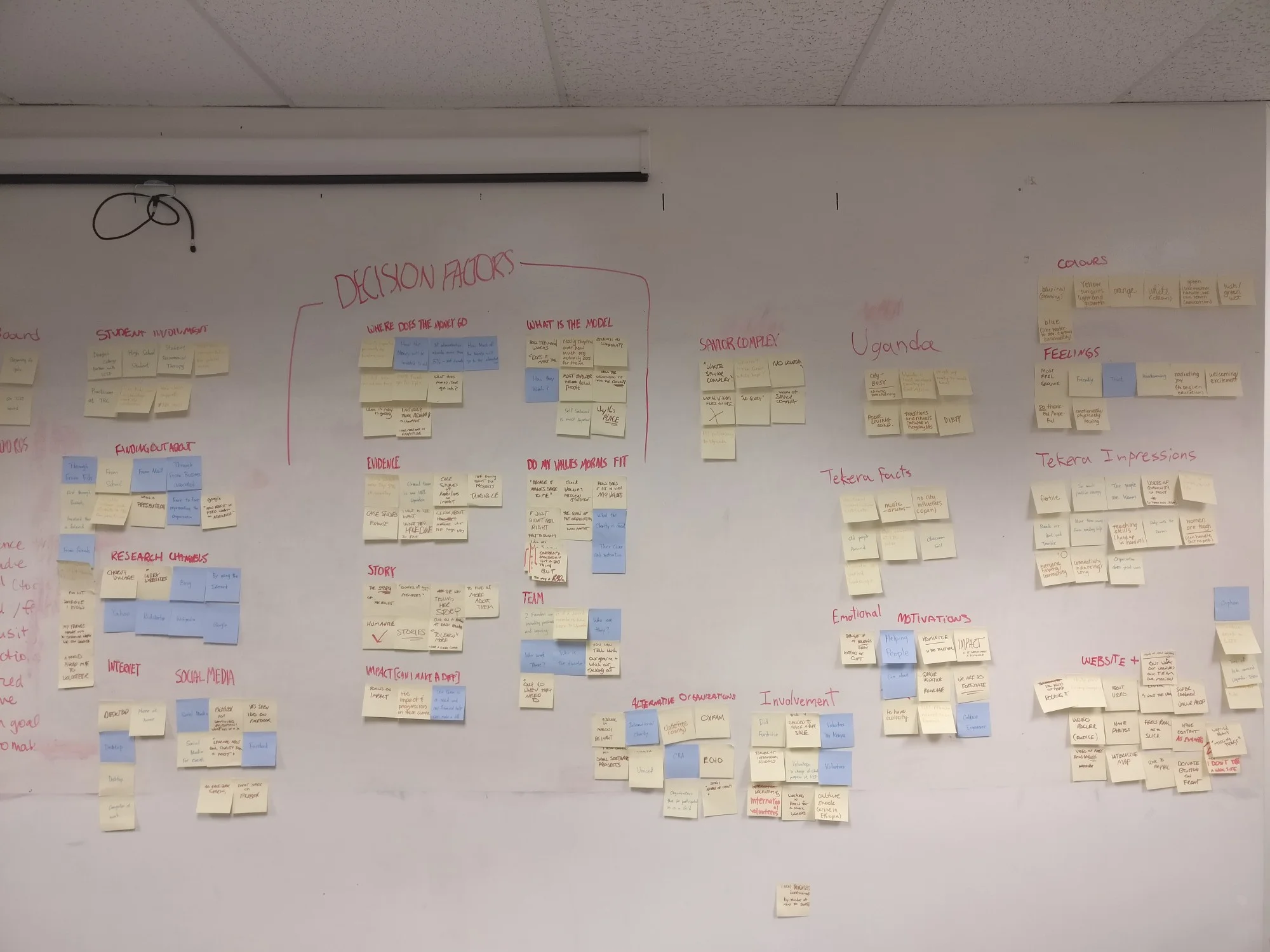
Affinity Diagram
After interviewing dozens of ICEF website visitors, our team analyzed the data we collected and uncovered the major pain points. Then we we grouped together the insights and created an affinity diagram.
Personas
Before we dove into the user flow, we needed to understand what kind of people were using the website . This was our top priority, because it helped our team to understand the user-base and provided us with framework for the rest of the design process.
—Click here to view the CASE STUDY